
Interiors
Kitchen Design That Ages Beautifully: Inside The Orient Project
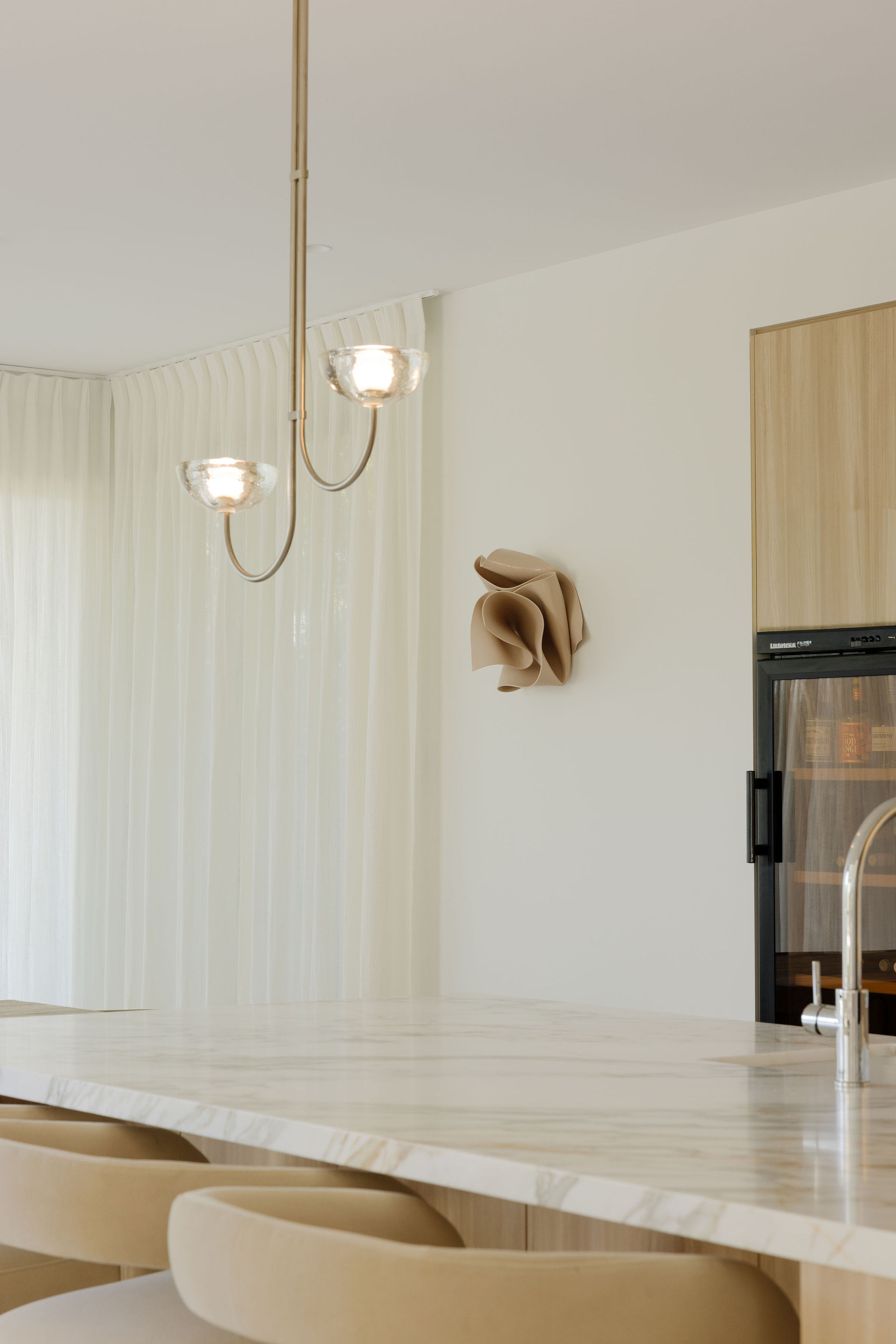
A study in restrained kitchen design, considered materials, and the case for changing everything without moving a single wall.
There is a persistent myth in kitchen design that a good one must announce itself. New footprint.Structural steel. An island the size of a small European car. We have designed our share of those, and there is a time and a place for the demolition-heavy renovation.
Orient was not that time, and not that place. The brief for this project was quieter, and (we would argue) more interesting. The existing kitchen design layout was, in fact, working. The plumbing was in the right places, the appliances landed where a family actually cooks, and the light came in from the correct side of the room.
To move any of it would have been a solution in search of a problem. Which meant the entire project had to be won on materials, joinery, and the small, obsessive details that separate a kitchen that looks good in the listing photos from a kitchen that still feels considered on aTuesday morning ten years from now.
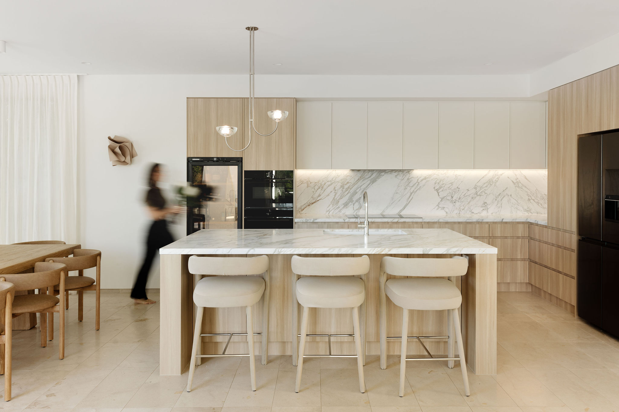
The brief: a kitchen design that would still feel right in 2036
Our client's ask was gentle but firm. They wanted bright, they wanted timeless, they wanted the kind of coastal reference that reads as location rather than theme, and they wanted the trades in and out on a domestic (not industrial) timeline. If you have ever spent six months without a working oven, you understand why.The temptation with a brief like this is to reach for a mood board no one could really argue with. Marble, brass, oak, done. But timeless is not the same as safe, and the difference lives in the specification.
We reworked the layout around a walnut floating vanity with a stone top and a vessel basin, then brought in a fluted ceramic feature wall behind it to add quiet texture. A freestanding bath anchors the wet zone, and a tiled niche with mitred edges (no metal trims, ever) keeps the finish clean and continuous. The palette is warm travertine-look tile, walnut timber, matte black and stone: a mix that photographs well today and will still feel right in fifteen years.
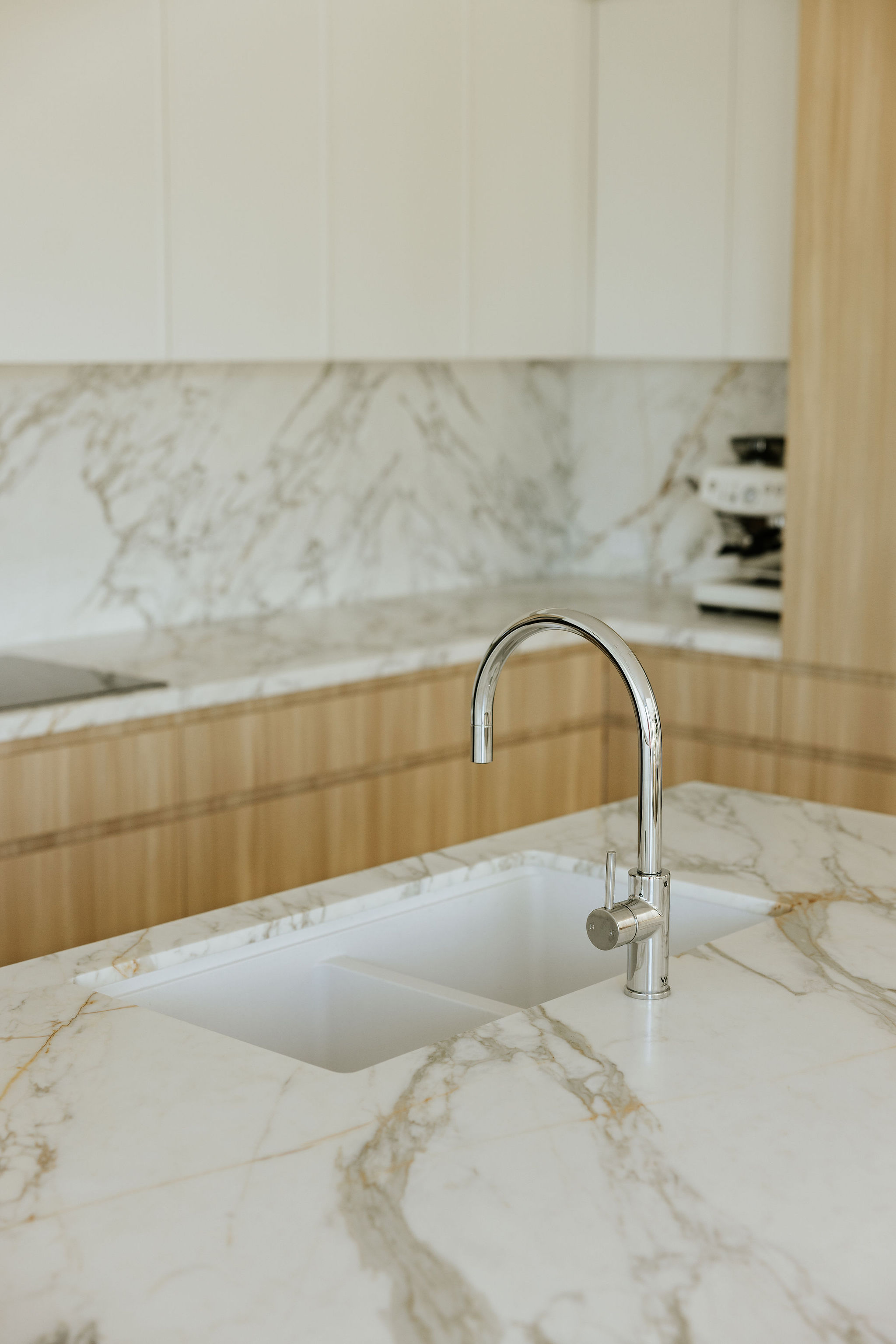
Keeping the kitchen design layout exactly as it was.
Modern kitchen design is dominated by the assumption that the layout is the thing that matters most. It is not. A good kitchen design layout that already exists is worth defending against the urge to move it, and Orient's original bones were sound. So we drew a line under the plumbing, kept the appliance zones where they were, and reallocated the entire renovation budget to what people actually see, touch, and use every day: cabinetry, stone, hardware, and light.If the phrase “reallocated the entire renovation budget” sounds unromantic, it should not. This is where great kitchen design is actually made. The rooms we love in Architectural Digest are not there because someone moved a wall. They are there because someone spent an unreasonable amount of time choosing between three shades of white.
The four-material palette that runs the whole kitchen design
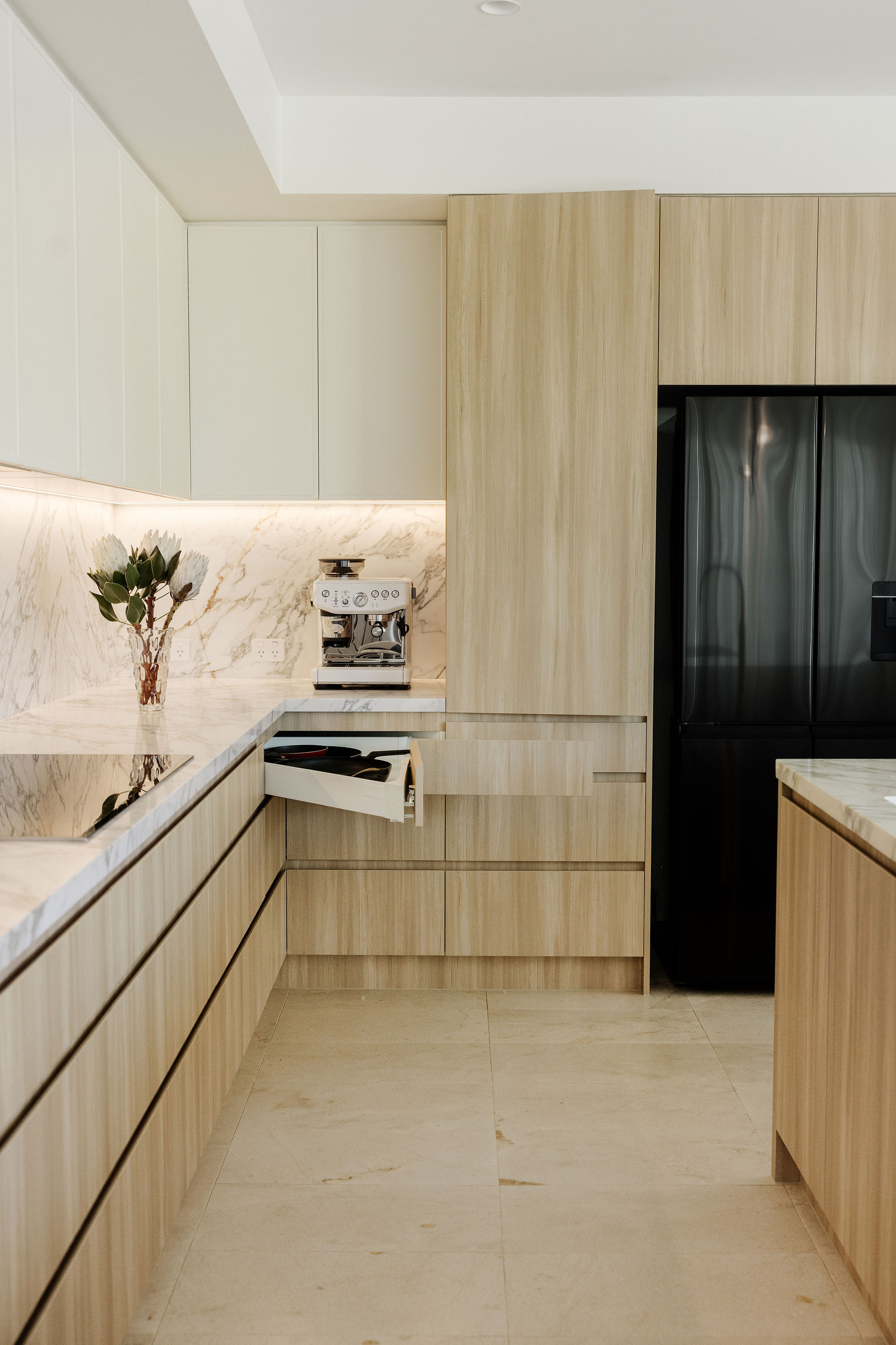
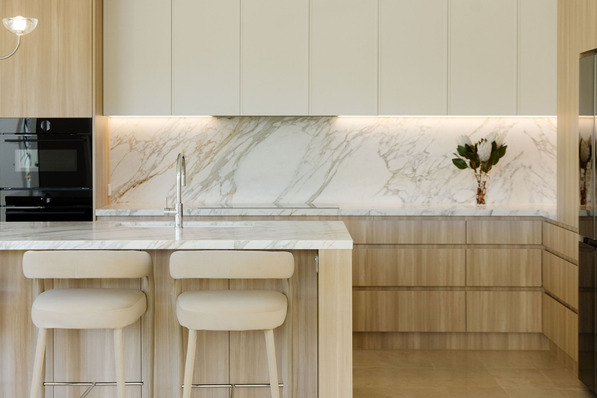
We built the scheme on four honest materials: timber, glass, metal, and white. Nothing more. Every oneof them was asked to do a specific job, and every one of them appears in more than one place. This isdeliberate. A kitchen design reads as considered when its materials repeat, and it reads as scatteredwhen they do not.Timber did the warmth. A soft, mid-tone hardwood veneer runs through the lower cabinetry and astretch of open shelving off the main room. It stops the kitchen from feeling clinical, and it grounds everyother material choice.Glass did the light. Reeded and clear panels in the upper cabinetry, softly framed glazing where we couldsteal light from an adjacent space, and a quiet negotiation between the windows and the wall behind thesink. In a kitchen, glass is doing more than you think.Metal did the tailoring. A single brushed finish, used consistently across every hinge, pull, tap andhardware moment. If we could make one recommendation to anyone starting a kitchen renovation, itwould be this: pick one metal finish and stay with it. That single decision does more for the room thanalmost anything else on the specification sheet.White held everything together. Not one white, but a small, controlled family of them. A warm off-whiteon the walls, a cooler stone in the joinery, and a soft chalky white on the joinery interiors. It is the thingyou will not consciously notice, and the thing that stops the room from ever feeling flat.
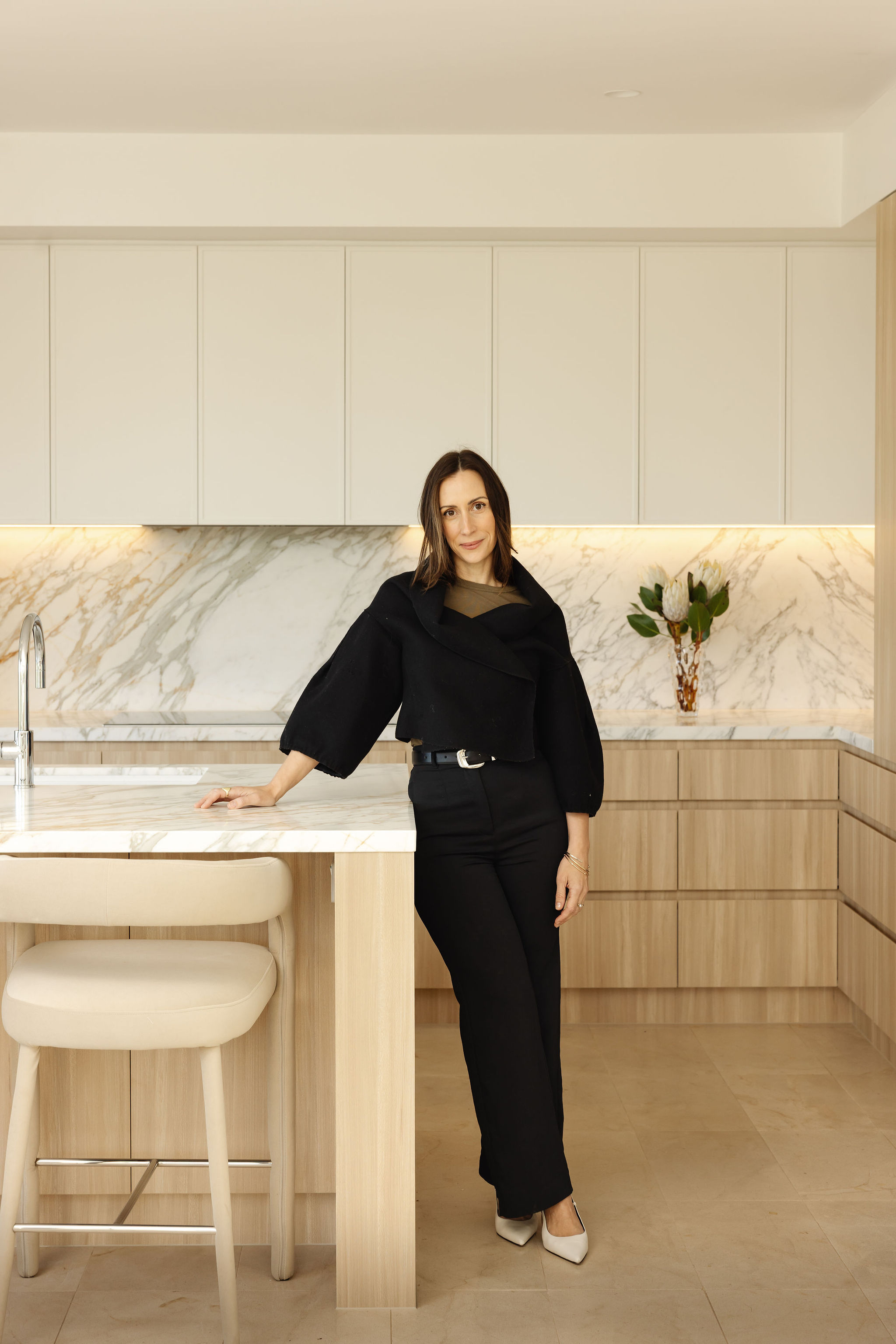
Upper cabinetry, finger pulls, and the case for mixed hardware
The single boldest choice in the room was giving the upper cabinetry a different character to the lowers.Where the lowers stayed grounded and timber-warm, the uppers went crisp and cool: a slimline profile,a subtle shadow-line detail at the top, and finger pulls in place of hardware.The finger pull is the smallest thing we discussed for the longest time. It is the detail that pushes akitchen from nice to considered without ever announcing itself. From two metres away, you do not seeit. From two centimetres away, you feel it. That is the tell of a kitchen design that has been thoughtabout by someone who cares.Where the finger pulls could not do the job (drawers under the sink, appliance cabinetry, the corner run)we specified tactile, beautiful hardware in the same brushed metal. Mixed hardware is one of the mostquietly Vogue Living coded moves in contemporary kitchen design. It gives a long cabinetry run rhythm.Some doors you push, some you pull, some you press. The kitchen tells you how to use it before you ask
Coastal kitchen design without the clichés
There is a version of coastal kitchen design that involves rope handles, a shell motif, and the word“coastal” printed on a cushion in an adjacent room. We politely decline.
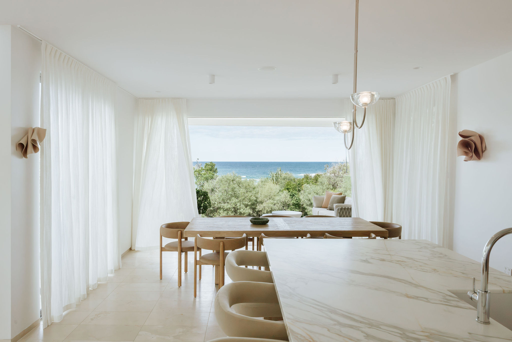
Our version of a coastal kitchen is built on light and material, not motif. Timber grain that echoesweathered dune wood. Brushed metal that catches the same afternoon light as the tapware in theoutdoor shower. Glass in the joinery that borrows sky-blue from the pool and quietly redistributes itaround the room. A family of whites that quotes the beach without ever having to say so.The result is a home that could only exist here, on this coast, in this light, without ever needing to spell itout. That is the version of coastal design we chase every time.
The takeaway: what a great kitchen design actually costs (and doesnot)
You do not need to move a wall to change a kitchen. Sometimes the most beautiful thing you can do fora room is leave the bones alone, choose fewer materials than you think, spend a little more on thefinishes you touch every day, and let the light do the rest.Orient reminded us why we love the projects that look, at first glance, like the smaller ones. They areusually the ones with the least room to hide, and the most room to get right.
Pearl Interiors Studios. Full-service kitchen design and interiors in Noosa and across the Sunshine Coast.